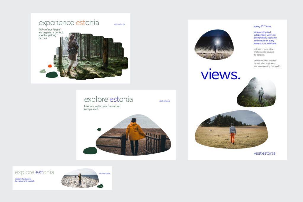
Enterprise Estonia, the state-run agency responsible for promoting Estonia abroad and attracting investment, launched two brand new web platforms – estonia.ee and brand.estonia.ee, at the cost of €200,000.
The new website estonia.ee replaces the estonia.eu site that had become obsolete and outdated, both in design and content. The long-serving “Welcome to Estonia” logo will be dumped as well.
Estonia.ee focuses on three core themes: digital society; clean environment and beautiful nature; and smart people. Brand.estonia.ee is essentially a toolkit, containing useful thoughts, tips and tools for everyone who wants to share Estonia with the world.
A search for the new identity
The new web platforms came about from the practical need – various institutions and entrepreneurs complained for years that the way Estonia was officially presented abroad, needed an improvement.
In a study, conducted in 2014, Enterprise Estonia questioned almost 500 top managers and CEOs of Estonian companies and asked how many of them have used either the “Made in Estonia” or the “Welcome to Estonia” brand when selling their products or services in foreign markets. The results were not exactly cheerful, to put it mildly – only four per cent had used these brands in the past and just two per cent still did at the time. At the same time, 50 per cent of entrepreneurs said that using a common Estonian brand would be helpful.
In 2015, Enterprise Estonia initiated a public competition to find a new logo and branding style for Estonia. The competition drew 650 submissions – some good, some mediocre, some awful. Enterprise Estonia soon announced that none of the submissions was convincing enough and it would start again from scratch.
Just estonishing
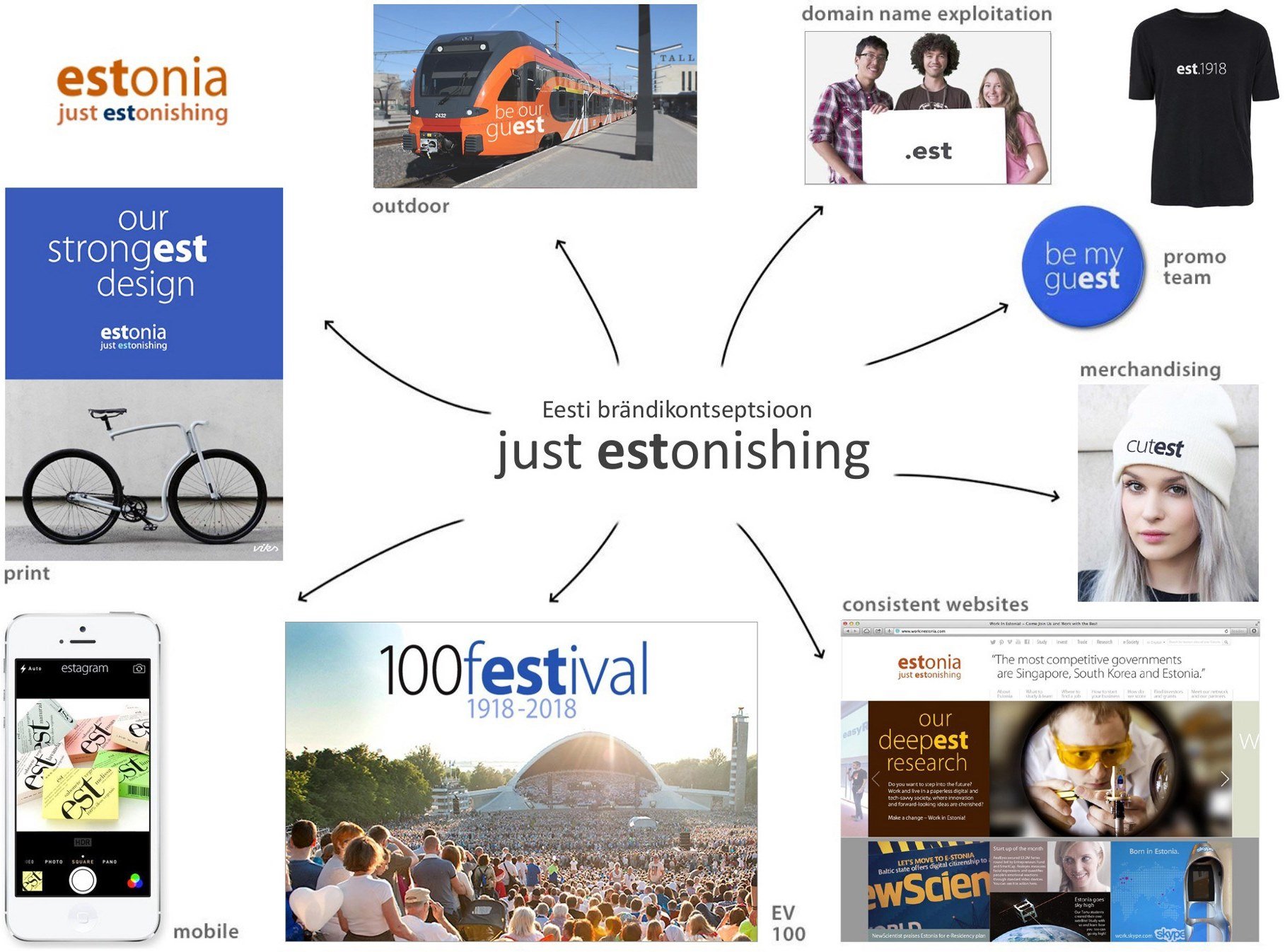
About the same time, the Eindhoven-based Dutch marketing and branding specialist, Peter Kentie, proposed another concept of nation branding for Estonia, where emphasis was playing around with an “-est” part of the country’s name, and a new slogan, “just estonishing”.
Kentie reasoned his motive by saying that he had visited Estonia many times and is “a convinced and proud e-resident”. “The country and the people touched me deeply and have such a positive impact on me that I decided to actively contribute to inspire and ignite the discussion on nation branding of Estonia,” he said at the time.
His idea received a generally warm-hearted praise in the Estonian society – since he had offered the concept “for free”, many people were pleasantly surprised. According to Kentie, he had also contacted Enterprise Estonia with regards to his proposal, but it was turned down.
Under public pressure, however, Enterprise Estonia relented and promised to “integrate” Kentie’s proposal into the new official concept. After the first, failed attempt, the organisation had established a team of professional Estonian designers, brand specialists and entrepreneurs to come up with new ideas.
A place for independent minds
The new web platforms that were launched on 13 January are the fruits of their labour.
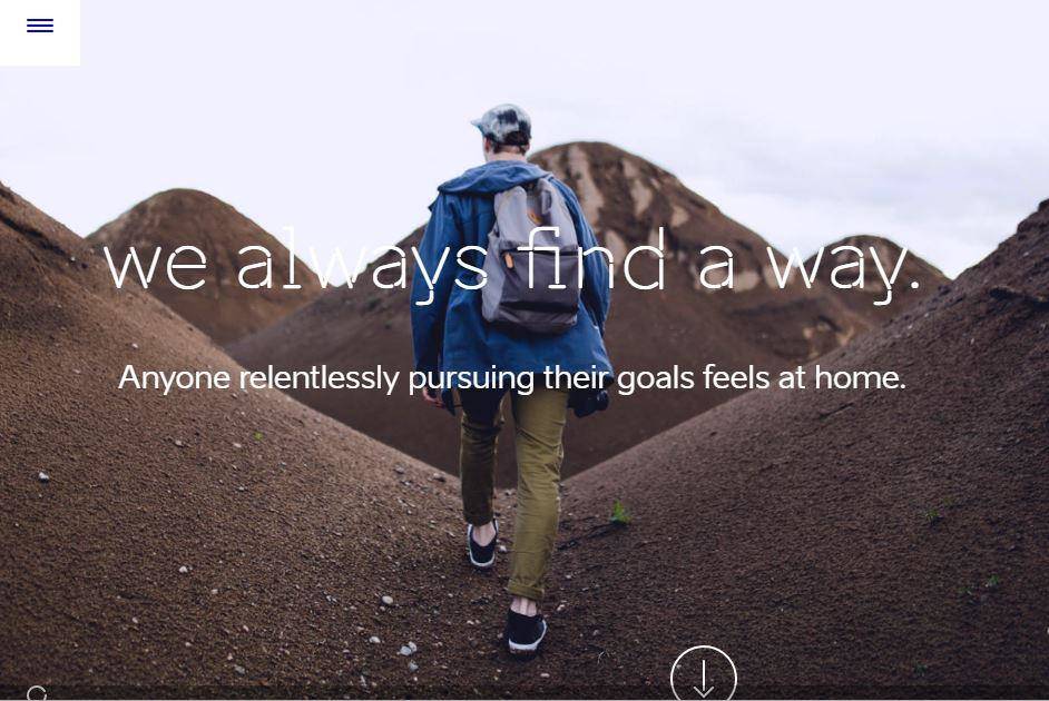
The new estonia.ee site, welcoming visitors with a slogan “Estonia is a place for independent minds”, aims to portray the country as the home of smart and resilient people, who “always find a way”.
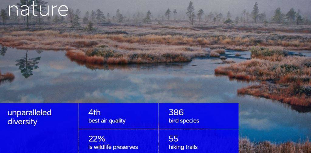
It highlights the society that is using digital means to get many tasks done – such as paying taxes, signing documents and voting, for example. Secondly, it places importance on showing what matters perhaps most for the ordinary Estonians – the fact that wherever one lives in the country, they’re never too far from the forest or wild nature.
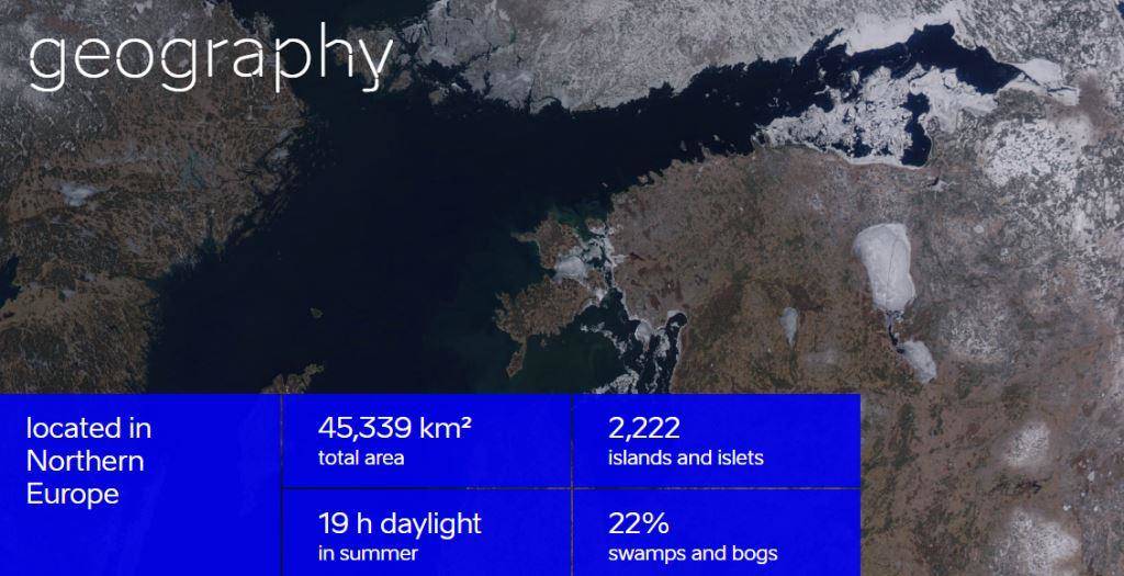
What’s probably surprising is the way the new platform draws a spotlight to previously unknown or little known facts – such as that there are 2,222 islands and islets in Estonia; that 22% of the land is covered by swamps and bogs; Estonians hold 133,000 documented folk songs; or that there are over 190 nationalities living in the country.
Boulder controversy
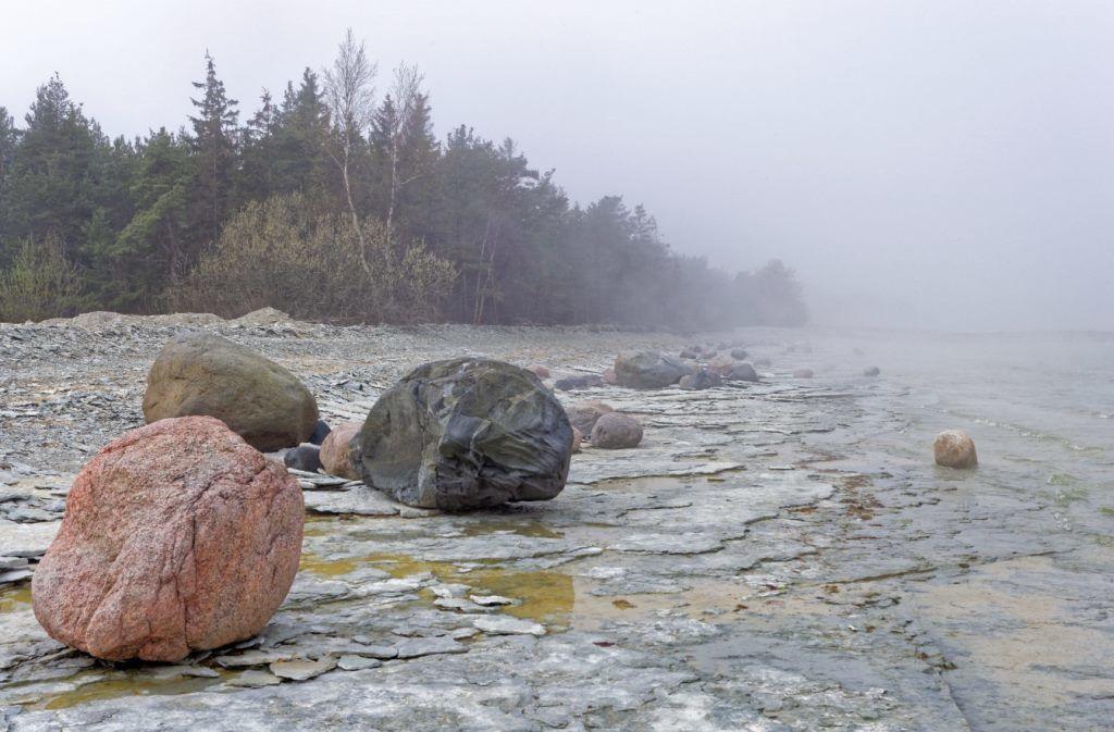
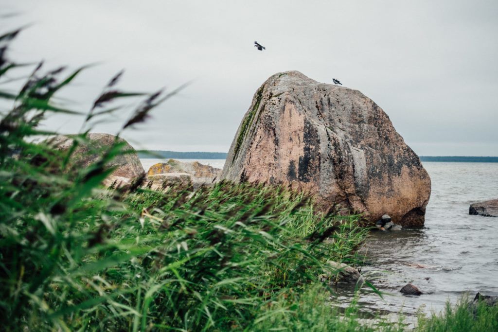
Perhaps the most unexpected is the assertion that most of the glacial erratic boulders of northern Europe are found in Estonia. “We have 62 known boulders greater than 30 metres in circumference. They are protected and serve as part of our national identity,” the site claims.
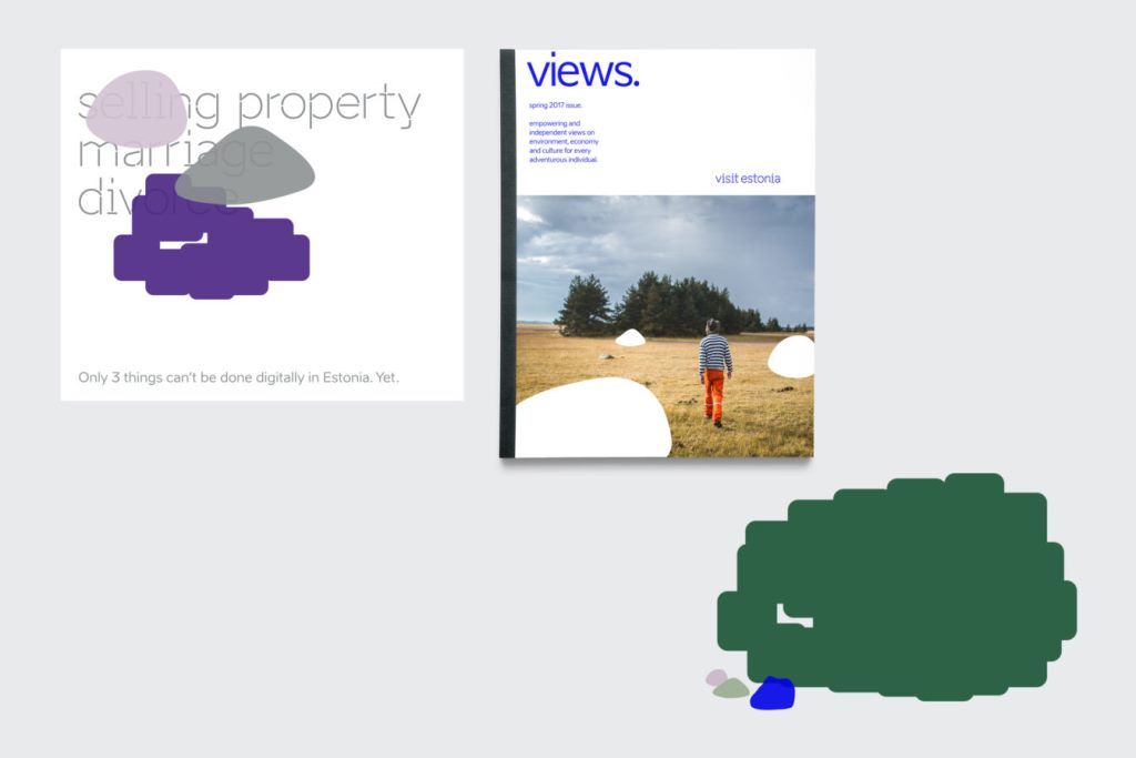
Domestically, the association with boulders raised many eyebrows – not helped by a green blob-like template that does not prominently feature on the new estonia.ee site, but on the brand.estonia.ee platform. It was already used on some of the sample merchandise by the design team. While it was supposed to symbolise a boulder, in the social media the blob has been compared to a “crying hedgehog” or a “puking turtle” instead.
As the controversial boulder icon unjustifiably threatened to encapsulate the work that had been done in order to create a clean and coherent style and identity for Estonia’s official gateway, some local entrepreneurs and opinion leaders were quick to call for Enterprise Estonia to make a public clarification and ditch the green blob.
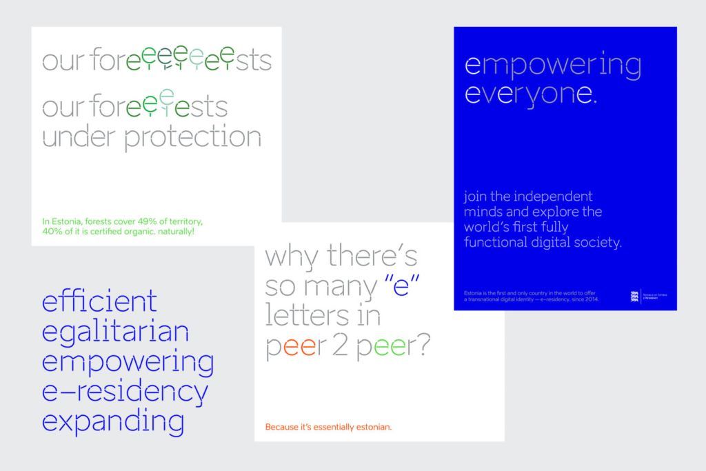
The platform also introduces a new font – called “Aino”, it was designed by typograph illustrator Anton Koovit. Another aim by the design team is to place more emphasis on the letter “e” in “Estonia” name.
Critics divided
Immediately after the new web platforms were launched, the Estonian social media was rife with jokes and discussions. While many designers and marketing experts praised the new style approach, others were not convinced and a fair number of ordinary Estonians were downright critical, forcing the design team to go on the defensive.
Martin Lazarev, a designer and photographer, who started to use Kentie’s “-est” motif last year on the t-shirts designed by his firm, was heavily critical.
“The new estonia.ee web platform is neat and pretty in design – but it is purely designed by designer to designer, not for common man. Soulless and lacking warmth and individuality, I would characterise its design approach as a neo-hipster minimalism. I think that ordinary people – ie not a designer or trendsetter – will not apprehend this design because it lacks an instant wow-moment,” he told Estonian World.
Lazarev said that while the new site looks visually good, it has fell short of its target. “I would say the design is sterile-clean, yet stylish. The site has a well-structured layout and I can sense good design cognition behind the work, but it has simply missed its mark – this style is not understandable for everyone. It leaves an impression that it was created in a vacuum chamber, detached from reality.”
“It leaves an impression that it was created in a vacuum chamber, detached from reality.”
He pointed out that the design team should have also made a better use of the Peter Kentie’s original concept. “The “-est” theme actually existed a long time ago. Kentie simply encouraged us to start using the good old idea again. But I’m also convinced the “-est” motif will continue to be used and come up again – Kentie’s proposal that revived it, already demonstrated the brilliance of the idea.”
“Morbid and immobile stones”
Lazarev was very critical of the green boulder-like image that was first mistakenly considered as the new official logo – as the design team later explained to the local media, it was actually meant to be a templet.
“I’m sorry, but the green boulder theme is laughable and the biggest mistake in the new concept. No matter how they want to present it – this idea doesn’t work and will not be understood, let it be Estonians or foreigners,” he said, adding that “boulders have already completed their journeys” and are simply “morbid and immobile stones”. “Are Estonians a motionless and static nation then?” Lazarev asked rhetorically. “Well, perhaps it’s true, because it’s already a fourth attempt to invent an Estonian brand – in other words, a changeless effort.”
“Are Estonians a motionless and static nation then?”
Lazarev was also unsure about the new colour scheme, which in his words is “graphically incoherent.” “Even as a designer, I’m not sure how to use it,” he said. “The new font is beautiful, but as a standalone, not worthwhile,” he added.
“In conclusion, the entire proposition is utterly weird. There is no story and no logo; we are back in square one again. But as we say – hope dies last. It will be interesting to see how long this farce will last,” Lazarev asserted.
Not everyone was as critical, however. “This is really, really excellent. I think it perfectly captured the spirit and appeal of the country,” said one foreigner, upon seeing the new web platform.
More style over substance
Peter Kentie, whose original ideas are not incorporated into the new concept, told Estonian World that Estonia’s new branding is more style over substance.
“Through my work and career, I have learned to focus, practice what you preach and show and tell. The whole Eesti nation brand project is a process managed by the commissioner and the creative people created a solution with their peers in mind. And they missed out on their task that it is to create for general use. You can’t leave out emotion and sentiment. Place branding is inclusive, engages a community, and activates people so they have to be involved. They are the brand!”
“There is a lot of room for improvement here. It is a bit style over substance and that can be improved by focusing. The toolbox has real worth though, on to version 2.0,” Kentie said.
I
Cover: one of the images from the brand.estonia.ee toolbox (photo by Arne Ader.)

