Peter Kentie, the Dutch marketing and branding specialist, says in a comment to Estonian World that the designers behind the new estonia.ee and brand.estonia.ee sites created a solution with their peers in mind, missing out on their task to create for general use by leaving out emotion and sentiment.
To be honest, I find it quite challenging to react in a meaningful and unbiased way. I am the author of the justestonishing.com proposal and I will be judged from that perspective.
Yet I am also a design and marketing practitioner who is able to reflect carefully and professionally on this new Estonian nation branding proposal. So, do allow me the room to communicate my thoughts, they are from a good heart.
After the public release of the “-est” concept, I signed an agreement last summer with Enterprise Estonia that they could freely use my proposal in any way. And during the creation phase I was in contact with the Estonian Design Team (responsible for designing the new web platform and visuals for Estonia – editor), visiting them and they visited me in Eindhoven. I gave my views based on the experiences with the creation and release to the public of the Eindhoven brand. Because that kind of makes or breaks the brand project. The PR part is an art in itself and has to be managed with the highest level of attention. I will come to that later.
Launching a new brand on a Friday is cowardly
My reflection on the work released, to start: a day before the weekend is not a good launch day and I don’t mean because it was Friday the 13th. It is a bit cowardly to do it on a Friday.
I prefer Tuesday, so you have a few good days to interact with the people and the stakeholders. You can’t hide during the weekdays. A place brand is owned by everyone, it is almost a social obligation to share everything openly and stand behind it when the wind starts to blow. One has to – the brand process is paid for with public money, so you have to communicate the value of the whole work to society very clearly.
“The brand process is paid for with public money, so you have to communicate the value of the whole work to society very clearly.”
A brand is not designed for the form or the beauty of a logo or typeface. A brand has to create a recognisable identity for a nation – in this case resulting in higher visibility globally and locally. Making people proud and increasing self-esteem, making the professionals, students, investors as such interested in the country. Making the storytelling possible in a coherent, consistent and inspiring way. Every place brand is as strong as the level of acceptance and inherent use.
“Every place brand is as strong as the level of acceptance and inherent use.”
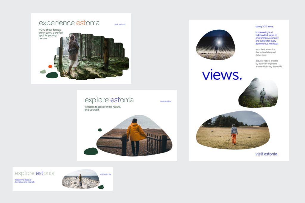
The new Estonian nation brand identity judged by the visual appearance is sophisticated and ultra-modern; Nordic flat design style.
The positioning
The positioning of a pioneering nation is effective and the accompanying tone of voice in text is written out sharply. On a brand value level, three simple values are presented: open, smart, active. Although these are so fitting and logical, I don’t see anything remotely close to their smartness in the final execution – no visuals, no reference to the identity.
My advice is to add liveability to the design. Currently, it lacks humour, witty touch in copy and headlines – and above all, warmth. One has to integrate fun into a project, recognisable for common man. It ought to create pride and self-esteem; something to talk about and to be part of for all Estonians.
“One has to integrate fun into a project, recognisable for common man. It ought to create pride and self-esteem; something to talk about and to be part of for all Estonians.”
Be aware, brand values should stand out and represent distinctive values and benefits. Open, smart and active is not a unique Estonian quality. Dare to be even sharper-focused with the brand values. Dare to create an iconic brand to bolster reputation abroad and create civic pride at home – the clearer the values, the easier the brand implementation.
The visuals
The graphic language with the icons and smart animations is of high class – really usable and identifiable with its own visual style. I am almost jealous!
“The graphic language with the icons and smart animations is of high class.”
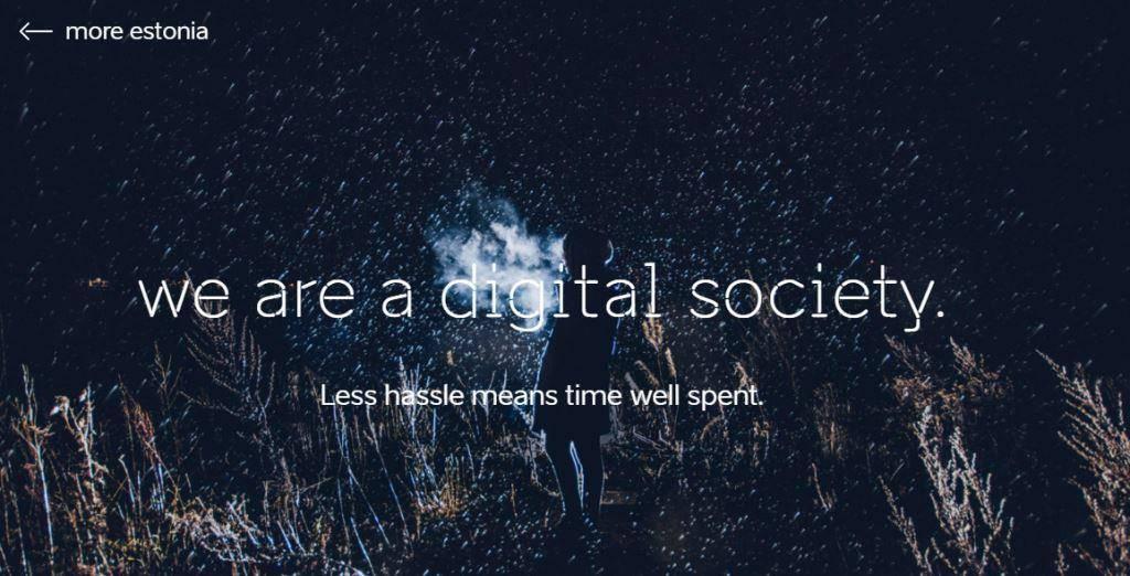
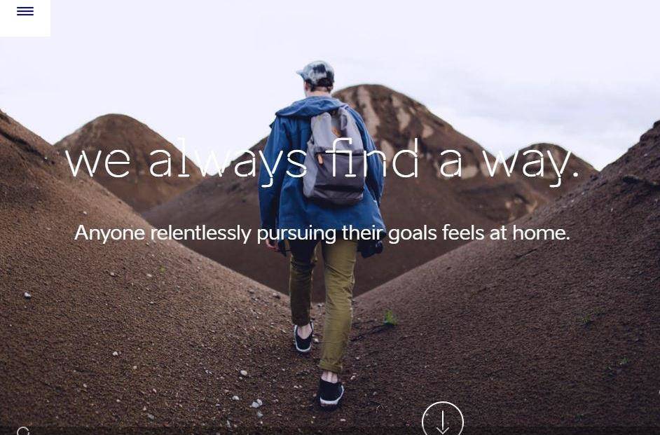
The visual or the photography style is, in theory, logical and fitting the spirit of Estonia beautifully. Though many example photography in the presentation leads to unwanted situation. Many photos, although of high visual quality, are unfit because of dark, gloomy, empty and mostly people shown with their backs towards the camera. Therefore, these are not really exciting images – in a world that is now so dominated by visuals.
The same goes for the video in the branding toolbox – it is beautifully executed, although I don’t understand why it starts with “Eesti” and then goes over into “Estonia”. There is a strong focus in the video on the wonderful Estonian nature. I wonder if the Estonian identity only ends there?
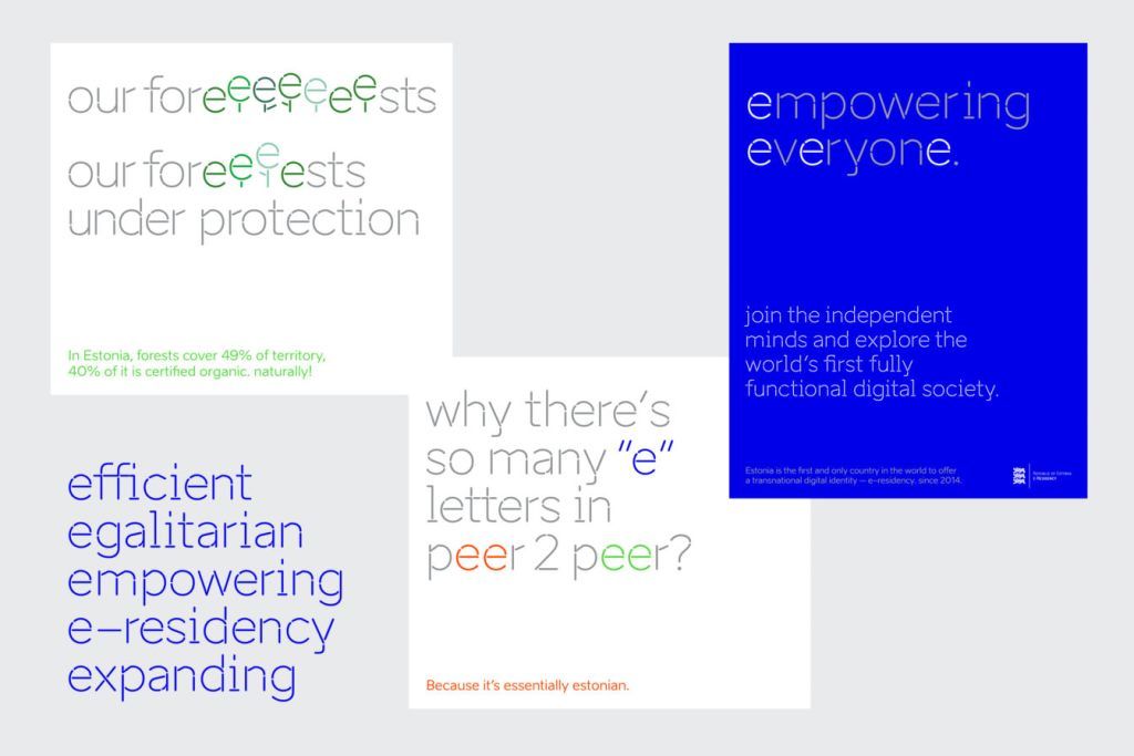
The “Aino” typeface has real personality and is versatile with three styles: stencil, normal and bold. In all headlines and prime use of the font, the stencil version is used. In my opinion, the created stencil font is a bit too thin as a really useable display font. Especially reversed out in photography, it gets easily blown away. Perhaps time for a bold version of the stencil font?
The colour scheme is elegant and tastefully executed – like almost everything in the identity. And again, the remark that a lot of colours are quite pale and subdued.
The boulder story
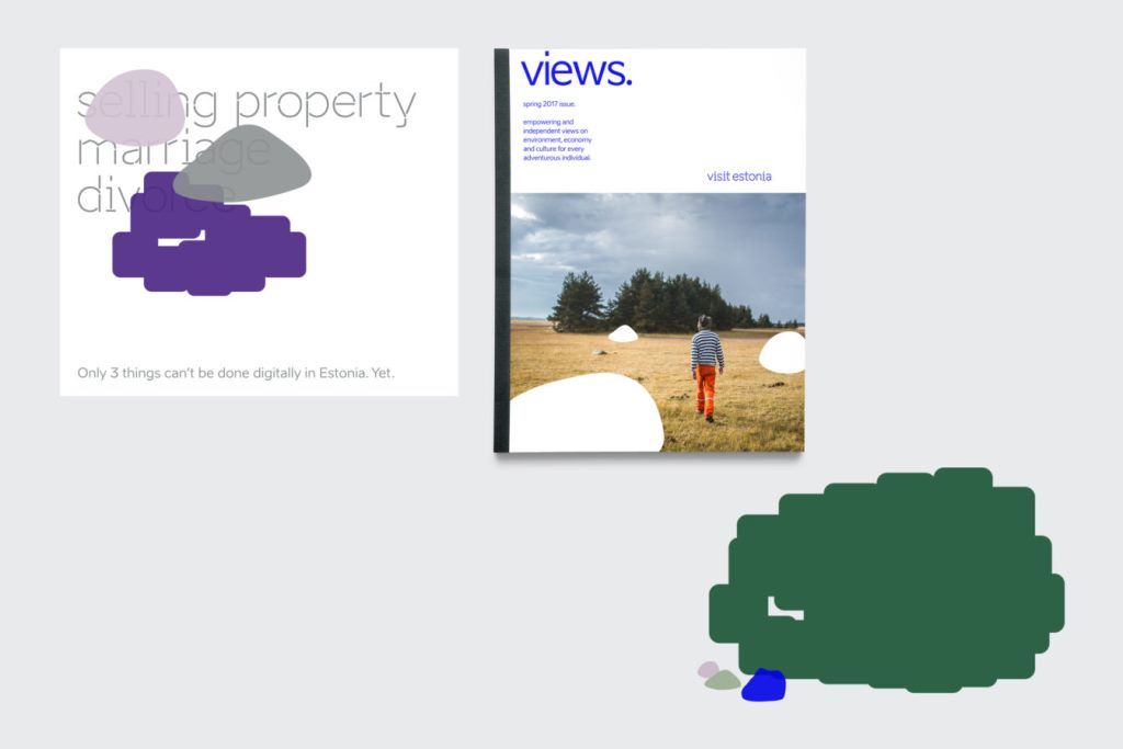
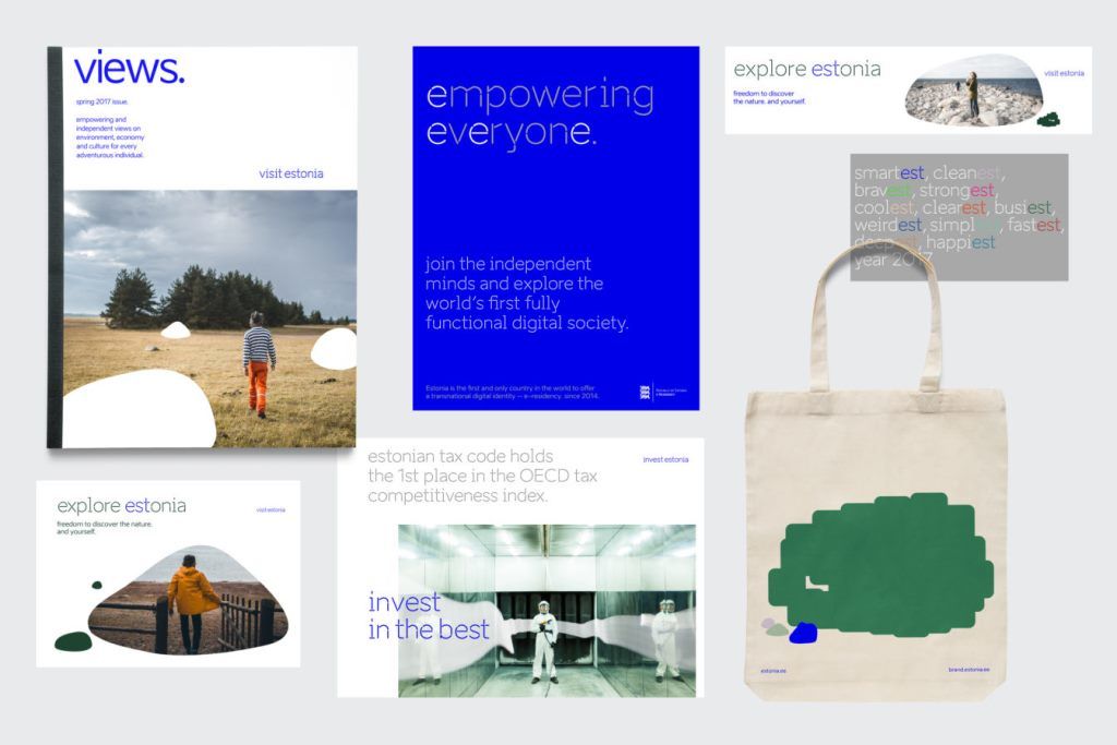
Well, the boulder. In theory, it is a unique and identifiable story, but in practical use a symbol that is contrary to the core of the brand values – open, smart and active. It doesn’t illustrate the values at all, it almost opposes them. So wrongfully framed and used. The boulder story is so unique that hardly anyone in Estonia knows this and people associate the stone either with Finland or inhabitable and unfertile land. As a graphic symbol, it distinguishes in a design, but it doesn’t fit in with the other (typo)graphical style as used on estonia.ee.
The website style is sophisticated, clean and utterly cool. There is not much to connect to from the heart – all communication is one-directional, much data and yet so little humour and feeling of welcoming. To share stories, they have to be presented on a plate to the online visitor. Now a single image dictates the homepage – that can’t be. Online readers will not revisit a site that doesn’t get updated visually. Come in Estonia; there are so many great stories online, give them a place. Now it is form over function.
“The boulder story is so unique that hardly anyone in Estonia knows this and people associate the stone either with Finland or inhabitable and unfertile land.”
Absent in the brand identity is social media solutions and examples. I think that is a serious mistake to not incorporate practical usage of the new identity on the core social media platforms. They are the only really usable and affordable global communication instruments for Estonia branding and marketing and now left out. It can always be added, but it should have been included at a launch. It is 2017 and Estonia is the leading digital society globally and has an obligation to have a fitting social, mobile and web media digital presence of highest level.
Relevance is the key
In general, my opinion is that the design team has worked toward relating heavy on Scandinavian flat graphic style, fitting with nowadays design trends and of high quality level. A nation identity may hint on that premise, but identity needs to primarily stay relevant to Estonia. And this relevance is the key.
The identity is not only to inspire other (top) designers, but mainly to create a tool for common businesses focused on inland or export market. Municipalities and organisations, tourism industry and knowledge institutions, they are “the clients” of the toolbox. And I really doubt with the current execution they will adopt the tools from the box and know to understand its use to create value.
“A nation identity needs to primarily stay relevant to Estonia. And this relevance is the key.”
In the presentation, all examples given are of corporate Estonia examples, no businesses. It’s great that the new branding is shown as a Photoshop example for investinestonia.com and e-estonia.com. But both live websites are still in their old form at launch day and the last even with the former president, Toomas Hendrik Ilves, on the homepage. This makes me sad and makes the initiative of the new brand less strong – because those websites are of higher significance than estonia.ee in my opinion to create economic value and welfare to Estonia.
Managing expectations
The people and all relevant stakeholders expected a logo and a slogan from Enterprise Estonia. That is what normally is given in a place brand. If both are not included, even chosen unwanted, the alternative offered has to be managed and introduced well. If you make a toolbox full of identity elements, then show how they are used – in real world situations. For example, in an advertisement for an exporter, showing how its house style is complimented by Estonia nation brand. Not a hostile takeover of someone’s identity, but adding value to the marketing and communication of bigger and smaller companies.
“If you make a toolbox full of identity elements, then show how they are used – in real world situations.”
In the brand presentation, the designers have shown almost an inward attitude. Instead of showing how the presented toolbox could be used, the designer presented the bare tools. The head designer, Alari Olav, is really proud of the visual quality Estonian Design Team has created, and he should be! But the practical use of the toolbox is the essence of the whole commission by Enterprise Estonia and in the end, the ministry of economic affairs and communications. If one makes a toolbox or framework, then show how the tools are used.
The new brand identity should be judged on its merits how applicable the guidelines and identity elements are. To help companies do economically good and even better, by supporting showing and telling their products and services. A toolbox is a tool for everyone. So, show and tell the benefits clearly. That is a lot more than just “supplying” the tools.
Also, the toolbox should have been tested in practice beforehand. By other designers, and of other levels to demonstrate if and how the chosen tools can lead to improving the communication of Estonian companies and institutions. Not just for state owned communication, also for the broad business sector with clear examples. Ideally a before-and-after rebrand situations showing the positive effect of the whole exercise.
Launching a brand is an art in itself
I stated on Facebook weeks before the launch that the launch is a project within the project. It is not for the show or to tell how good you are. It is to inspire the use of your work and that requires a strong tactic.
“It is not for the show or to tell how good you are. It is to inspire the use of your work and that requires a strong tactic.”
Now “the boulder”, which was in the last part of the presentation, has created a real public relations issue – to put it mildly – because it drew all the attention of press and public. A PR professional knows how it works in real life: the newspaper photographer looks for this one shot that represents it all – and unguided by the team, the role of the boulder weighs in too much and everybody jumps on that sole element when published. “What is that all there is for 200k…?”
That kind of reaction could have been prevented. Focus on detail is so important, as in the India bag (the green boulder images were printed on sample merchandise bags that had been ordered from India – editor). Almost think in the perspective of the receiver of the communication, not the sender.
Staying silent is not clever
And when it came over this weekend, rule number 1 is never launch a brand on a Friday unless you have something to hide. That happening, one should also have to courage to stand up for it. Defend, team up together, react to the people on the Facebook with good arguments, say that you are listening and learning from the criticism. After all emotions are subsided, then act and show version 2.0 of the brand toolbox of Estonia. Staying silent is not clever and is harmful. People sense that you don’t stand behind your own work if left alone on social media shitstorm.
“After all emotions are subsided, then act and show version 2.0 of the brand toolbox of Estonia. Staying silent is not clever and is harmful.”
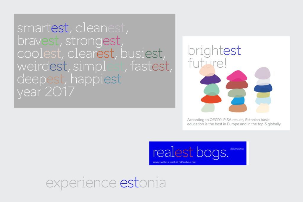
Of course, in my (unbiased) opinion, I would have liked to see more “-est” thinking in the suggested identity – yes, it is shown in the presentation and in the toolbox, but in a diluted way. Bit with the handbrakes on; more decorative as a highlight of a word, instead of functional to use it as a superlative. It is hard to find an overall focus – talking about many good things and nothing in particular about Estonia.
So the “-est” concept is in visual form in the toolbox, but actually not that much implemented. I sincerely hoped that the “estonishing” wordplay would have been adopted by Enterprise Estonia. It is not in the toolbox, maybe in future in marketing examples, who knows. The toolbox is identity driven and not marketing oriented. In this phase focus is probably more on basics and brand core. I do hope to see “-est” concept and “estonishing” examples in the activation, aka campaign, part of the branding. In general, people and businesses in Estonia like it, so use it.
People are the brand
Through my work and career, I have learned to focus, practice what you preach and show and tell. The whole Eesti nation brand project is a process managed by the commissioner and the creative people created a solution with their peers in mind. And they missed out on their task that it is to create for general use. You can’t leave out emotion and sentiment. Place branding is inclusive, engages a community, and activates people so they have to be involved. They are the brand!
“Place branding is inclusive, engages a community, and activates people so they have to be involved. They are the brand!”
There is a lot of room for improvement here. It is a bit style over substance and that can be improved by focusing. The toolbox has real worth though, on to version 2.0. Let me in and contribute, I have so much to offer to improve. Always better than standing on the sideline with an opinion.
A nation brand can only work if it is adopted by the users; if there is something to love and people know there is someone who really cares for it.
I
The opinions in this article are those of the author. Cover: one of the images that features on the estonia.ee website.

Dearest Peter!
Today we are celebriting 99 years of ESTONIA. We are most thankful for your gift to estonian people: “Place branding is inclusive, engages a community, and activates people so they have to be involved. They are the brand!”
We would like to prepare a reciprocal gift to you and your countrywomen and countrymen in mostly below sea level but mostly man-made Netherland. It will be ÜLESTÕUS. Hope to do this together. With more we will be back soon.
With warmest wishes,
Ragnar and Kristi
You make me curious!
https://uploads.disquscdn.com/images/28838f944c3b0f3ee7da48cd4a4b23874b4c97c449af09db0685932e41332dd9.jpg
Dear Peter,
You are an innovational specialist of marketing and branding in Netherlands, and I am an Estonian medical doctor. I hope that we could cooperate. Estonian chairmanship in the European Union is a good time to pay attantion to human-chair interaction.
Netherlands is extraordinary in several aspects of its health care*, but in the European Union Member States Sitting Championship, Netherlands ranks first. Estonia holds the eighth place. Thus, action is needed to change this. The time for UPRISING (in estonian: ÜLESTÕUS) is here. Let´s do it as a gift to both of us, and to the people in Estonia and Netherlands.
Please find my call to rise up published in estonian newspaper Maaleht jpg enclosed here, Ülestõusmise aeg on käes, in estonian; and THE TIME FOR UPRISING IS HERE english version attachment enclosed in email sent to you.
Ragnar
*http://www.nationmaster.com/country-info/profiles/Netherlands/Health